
Context
In September 2017, I joined Square as a Product Design Intern. Square is known for its innovative financial products and merchant solutions. It prides itself on clear, user-friendly designs across its platforms.
I joined the Support Engineering team, which focused on improving the support experience for Square customers.
Two projects I worked on stood out for their impact and scope: the complete overhaul and redesign of Square's system status page and the redevelopment of the navigational structure for Square's support centre.
Problem

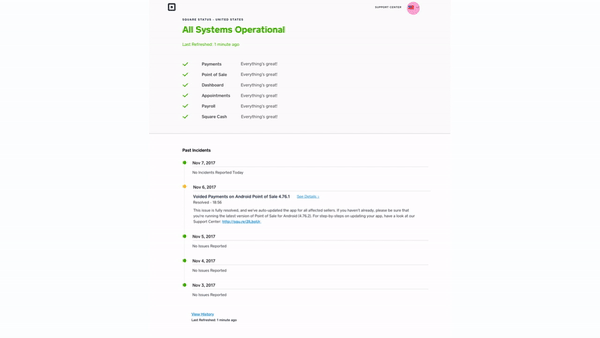
Old status page for Square
The existing system status page at Square was disconnected from the broader Square design language, out of step with the wider sleek design the company was known for. It failed to provide users with an immediate, at-a-glance understanding of system health, which is crucial for users relying on Square for their payment operations. The lack of clarity and visual alignment with the broader brand necessitated a complete redesign.

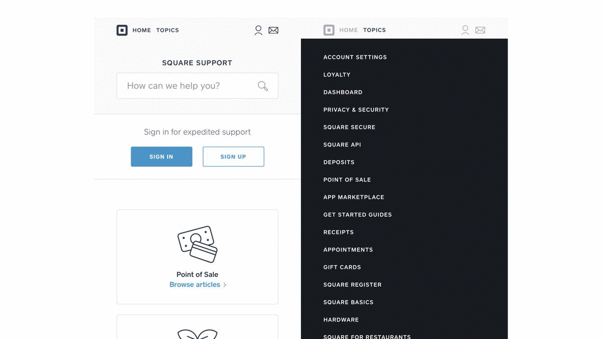
Old landing page for Square support center
Similarly, Square's existing support centre's navigation structure could have been more convenient and optimised for mobile. Usage stats showed an increasing number of customers were looking for answers using mobile devices, making responsive navigation crucial.
Another redevelopment goal was to reduce the volume of direct support requests through phone calls and messages, encouraging users to solve their issues and reducing strain on our customer service resources.
Solution
System Status Page Redesign

Redesigned Square status page
The status page's redesign was driven by a need for clarity, glanceability, ease of use, and modernisation—consistent with Square's existing design system.
I introduced a clean, modern layout that leveraged consistent and clear typographic and colour-based systems. The universally recognised traffic light approach ensured that users just had to glance at the page to assess system health quickly.

Design system for Status Page
To validate the design direction and ensure they met the needs of our diverse user base, I created over 15 user flows covering a wide range of scenarios. These were developed into Invision Prototypes, allowing for interactive walkthroughs for Square's stakeholders.
Translation flow for status page
Support Center Navigation Redevelopment

Iterative design process for the Square Support Center landing
The redesign of the Support Center navigation aimed to simplify the user journey across our support pages and greatly improve the user experience on mobile.
I analysed the existing navigation and support pages, identifying key pain points and areas for enhancement. I looked at multiple revisions through an iterative design process, refining the navigation and page structure to be more intuitive and user-friendly.
Mobile specific enhancements to the navigation
One critical innovation for the support centre navigation was introducing a dynamic, context-sensitive navigation bar that was adjusted based on user interaction patterns and search queries. This adaptive feature ensured that users were presented with the most relevant support options tailored to their immediate needs.
On mobile, we added quick menus that floated near the keyboard, allowing for one-handed use and significantly reducing the effort required to seek out information while using a mobile device.
Overall, we saw a 45% reduction in mobile user bounce rates. Feedback from testers highlighted ease of use and enhancements to their overall support experience.