
Context
There are currently (at the time of last edit) 20,806 primary schools in the United Kingdom. Each of these schools is mandated to accurately report pupil assessment and attainment information to the Department of Education.
This results in a large data burden on schools, with individual teachers being tasked with collecting and collating this data. This responsibility has increasingly necessitated digital solutions to manage the vast data involved.
This presented an exciting market opportunity for a potential solution to challenge this status quo, focusing on user experience — a tool designed to streamline data management while allowing teachers to focus on their primary passion: teaching.
Problem

A FigJam workshop looking at existing Sonar V1.
Juniper's legacy version of Sonar struggled with scale and rising maintenance costs. Proposals were drawn up for various options, including a complete product redevelopment from the ground up.

Juniper Sonar V1
Our initial findings revealed that several of the platform's existing 40+ reports suffered from abysmally low usage rates, with some critical reports being utilised by less than 10% of our user base. Customer satisfaction rates were also low, averaging around 30%.
This stark revelation highlighted the urgent need for a full-scale redevelopment of Sonar, prompting a shift towards a more intuitive, user-friendly design in what would become Sonar V2.
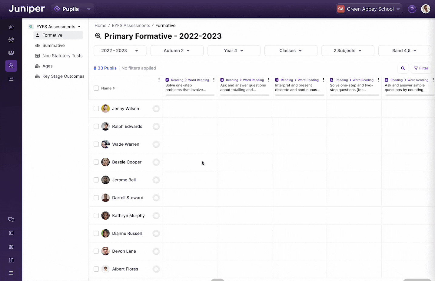
Solution

Sonar V2 Data Entry Screen
After conducting focus groups with our in-house operations teams, user studies with customers, and several design sprints, I established the design direction for what we internally referred to as Sonar V2. The goal was to create a design that was intuitive, simple to use, and accessible to all users, regardless of their technical literacy levels. This approach would require a concerted effort across most of the company, including our product, engineering, and operational teams.
Our primary focus was data tables, aiming to replicate familiar patterns from tools like Excel and Google Sheets that our customers were already accustomed to. By mimicking their existing workflow, we intended to reduce the cognitive burden of inputting and manipulating data.
With continuous feedback loops, working with our in-house experts and external customer base, we fine-tuned our approach until we achieved a result that catered to our users' diverse needs and preferences.
Subsequent user testing, which included monitoring navigation time and task completion rates, confirmed the success of our efforts. Overall, the streamlined navigation and enhanced report discovery proved to be practical improvements for Sonar V2, with average beta customer satisfaction rates hovering around 80%.
Details
Contextual Information, anywhere

Examples of contextual slideovers
Utilising sliding panels, we implemented consistent approaches across the entire product to access quick, contextual information with a single click. For example, anywhere a pupil's name appears, a single click allows you to "glance" at their full profile.
Similarly, a grade "slideover" would allow you to triangulate three types of data—summative grades, formative grades, and test scores. This previously required looking at three separate reports and was an invaluable feature addition for customers.
Intuitive pickers and a "Wayback Machine"

An assortment of Assessment Pickers
The pickers were an intuitive way for teachers to quickly enter large amounts of data. A user simply had to click in a cell and begin typing. The picker would appear and start offering smart suggestions, filtering down as they typed.
Incorporating a similar triangulation feature to the "slideover" allowed users to see a child's previous results at the data-entry point.
Finally, I added the ability to copy from the previous term. During research and working with users, we found that the data often doesn't change from term to term, so this was a quick way for a user to use the last term's data as an option.
Smart Dock for tables
One of the features of the Smart Dock, bulk filling a column
The dock was a prototype we designed during a design sprint to improve bulk actions on tables. We wanted to offer users quick, contextual actions while keeping their focus on the important task of data entry.
Upon selecting users, the dock would appear in the bottom center of the table, letting the users choose various actions to apply to the cells.
Quick Filtering

An example of the table filters
As mentioned above, filtering and navigation were major pain points with the old system. We considered several options for filtering before opting for an approach with two types of filters, "On-Page Filters" and a complete Filter Menu.
Looking at user data from the old system, the on-page filters were commonly used filters that were conveniently across the top of data tables and reports.
The filter menu contained the remaining filters in a convenient slideover. We broke these down into relevant categories, making it much easier for users to find the desired filter.